Making data more readable is a good way to increase your efficiency with little effort. If you are working with a lot of data in Excel, highlighting every other row can make it easier to find an item. This formatting can also give your spreadsheets a more professional look and feel.
Here, we’ll cover multiple ways to color every other row in Excel to get you started.
How to Change the Color by Selecting Every Other Row
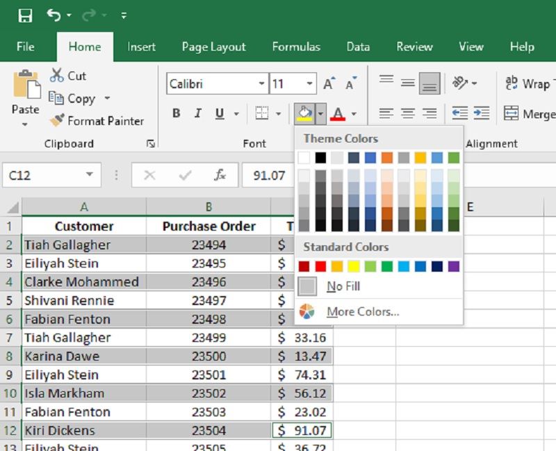
The most intuitive way to change the color is to select a row and fill in the cells with the color of your choice.
To select a row, click on the row number on the left-hand side of the screen. You can also select multiple cells or rows by holding the Ctrl key while selecting them.
To change the color, go to the Home tab and select Fill Color, which looks like a paint bucket icon, in the Font group.

Clicking on the dropdown menu by the paint can icon lets you choose from a large selection of colors—you can even find more colors with the More Colors option.
This is an easy way to color every other row in Excel, but it does have some limitations.
It can be time-consuming when working with a large table. The color is also hard-coded to those cells, so if you change the location of the cells by applying a sort or filter, the colors move too.
Instead, you’re better off creating alternating colors in an Excel Table.
How to Create Alternating Colors in an Excel Table
The best way to color every other row in a spreadsheet is to use the table features in Excel. If you format your entries as a table, you can use built-in color formatting templates with them.
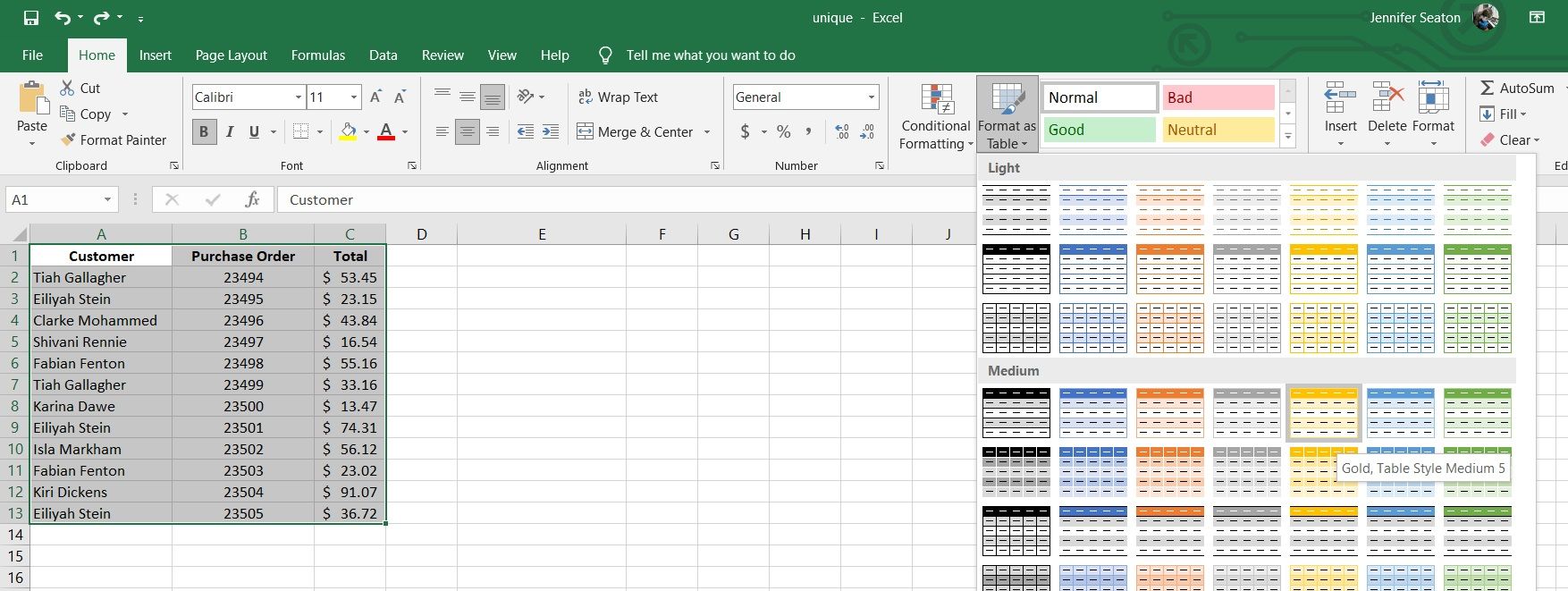
To do this, select the option Format as Table from in the Styles group of the Home tab.

Tables have many different formatting options. Once you find the best style for your table, click on it. Excel prompts you to select the cells you wish to apply the formatting to.
It’s that simple!
This method has several advantages over the previous one. If you manipulate the data in the table, the color formatting doesn’t change. It’s also much quicker to color a large amount of data.
Tables also have some additional features that can be useful. Once you convert your data to a table, you should notice that some dropdown menu icons appear in the table headings. These menus give you quick access to search and sort functions.
Adding Custom Formatting to Your Table
There are many pre-built designs to choose from with Excel tables and you can also create your own custom design.
To create a custom style, select New Table Style… from the Format as Table dropdown menu. A popup menu presents more options to let you really fine-tune your table’s style:
- Add formatting to the Whole Table to apply it to all of the cells.
- Stripe refers to the alternating colors. They can be added to the columns or the rows.
- If you want a color to appear on multiple rows before alternating to the next color, you can increase the Stripe Size.
- The Advanced Style features also allow you to customize the first or last row or column. The first row is referred to as the Header Row, and the last row is the Total Row.
- You can add special formatting to the first or last cell in the Header or Total row.
These advanced features offer a lot more customization. The only limitation is that the body of the table is limited to two alternating colors.
How to Color Every Other Row in Excel With Conditional Formatting
Conditional formating requires a little more work, but it offers the most freedom to create custom styles, including three or more alternating colors.
Let’s start by looking at how to create two alternating shaded rows:
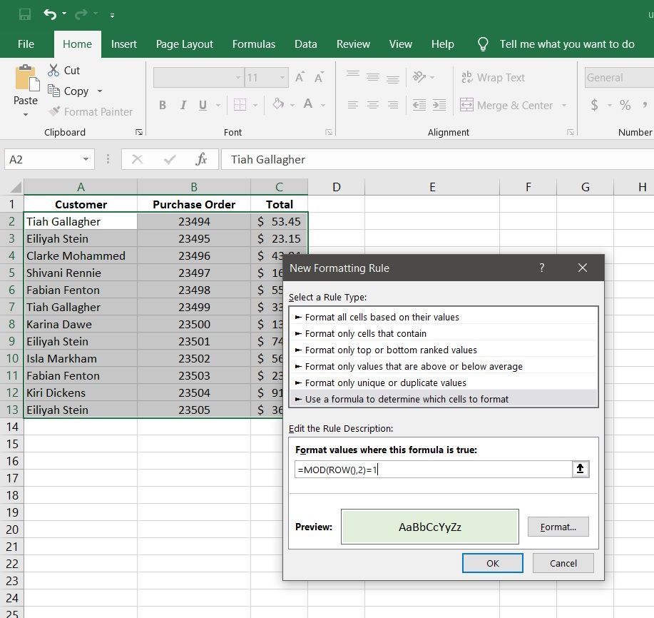
- Begin by selecting the data range you wish to style.
- Click on Conditional Formatting in the Styles group on the Home tab.
- Select New Rule… from the dropdown menu. This brings up a popup menu.
- Select the Rule Type that allows you to use a formula.
- Enter the formula: =MOD(ROW(),2)=1
- Click on the Format… button and choose formatting for the odd rows.
- When you are done, click OK to exit the formatting menu and click OK again to exit the Rule Formatting menu.

Every second row should now have the formatting that you chose. To get the most out of this method, let’s break down how it works.
The first equals (=) sign indicates that we are entering a formula. This is similar to how you enter formulas into cells in a spreadsheet. The rule requires a formula that can evaluate a cell. If our formula returns true, the formatting will be applied.
We want our formula to be based on the position of the cell. To access information about where the cell is, we use the function ROW(). It returns the row number of the cell. Now, we can check if the cell row is an odd number, and if it is, add our formatting.
There is no function that can tell us if a number is odd or even. But, Excel does have the function MOD(). MOD stands for modulus. Remember when you learned division as a kid? Before you learned how to divide using decimals, you would have used remainders. Modulus is the value of the remainder of a number after division.
To check if a number is odd, we can use modulus. If a number divided by two has a remainder of one, it must be odd. In our formula, the first parameter in MOD is the number we are checking (the row number) and the second parameter is the number we are dividing by (two).
The last part of the formula creates the condition. If MOD(ROW(), 2) equals one, then we apply the formating. This seems like a lot of work compared to the previous example, but it can give you more options than table formatting. For example, you aren’t limited to alternating between only two colors.
Creating a Table With Multiple Alternating Colors in Excel
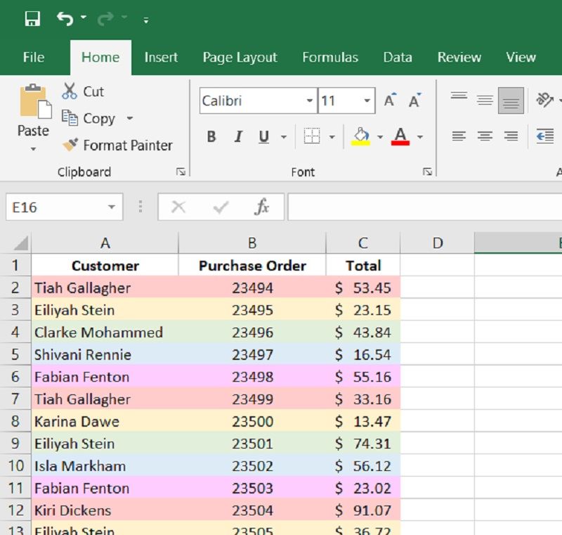
With rule formatting, we can use as many alternating colors as we wish. The only trick is to keep track of the order. Modulus can help with that. It can tell us more than if a number is odd or even. For example, perhaps we want three alternating colors.
We could use the formula =MOD(ROW(),3)=0 to select every row divisible by three. Similarly, if we use the formula =MOD(ROW(),3)=1 it would select the next row. And =MOD(ROW(),3)=2 would select the row after that.
Using this method, we can have as many colored alternating rows as we wish.

Formatting Can Improve Readability
With all the different formatting options available, it can be tempting to go a little crazy with colors. But remember, less is sometimes more. That’s definitely true for formatting.
Focus on adding features that improve readability. Consider what types of information you need to scran for the most. Once you know what information you need to highlight, you’ll be able to determine the best method to format your data.


