Article in Next Button: 899988
Jupyter Notebook is the number one go-to tool for data scientists. It offers an interactive web interface that can be used for data visualization, easy analysis and collaboration.
Data visualization enables you to find context for your data through maps or graphs. This tutorial offers an insightful guide to interacting with graphs in Jupyter Notebook.
Prerequisites
You need to have Jupyter installed on your machine. If it’s not, you can install it by entering the following code into your command-line:
$ pip install jupyterYou’ll also need the pandas and matplotlib library:
$ pip install pandas$ pip install matplotlibAfter the installations are complete, start the Jupyter Notebook server. Type the command below in your terminal to do so. A Jupyter page showing files in the current directory will open in your computer’s default browser.
$ jupyter notebookNote: Do not close the terminal window that you run this command in. Your server will stop should you do so.
Simple Plot
In a new Jupyter page, run this code:
import matplotlib.pyplot as plt
x=[1,2,3,4,5,6,7,8]
y=[2,4,6,8,10,12,14,16]
plt.plot(x,y)
plt.show()
The code is for a simple line plot. The first line imports the pyplot graphing library from the matplotlib API. The third and fourth lines define the x and y axes respectively.
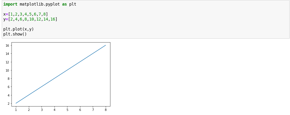
The plot() method is called to plot the graph. The show() method is then used to display the graph.
Suppose you wish to draw a curve instead. The process is the same. Just change the values of the python list for the y-axis.
import matplotlib.pyplot as plt
x=[3,4,5,6,7,8,9,10,11,12]
y= [9,16,25,36,49,64,81,100,121,144]
plt.plot(x,y)
plt.show()
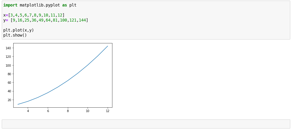
Notice something important: in both graphs, there’s no explicit scale definition. The scale is automatically calculated and applied. This is one of the many interesting features that Juypter offers which can get you focused on your work (data analysis) instead of worrying about code.
If you’re also vigilant, you may observe that the number of values for the x and y axes are the same. If any of them are less than the other, an error will be flagged when you run the code and no graph will be shown.
Types Available
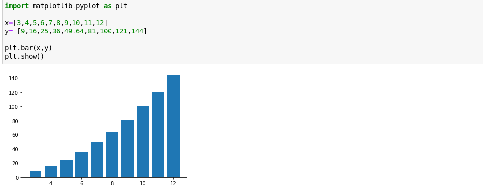
Unlike the line graph and curve above, other graph visualizations (e.g a histogram, bar chart, etc.) need to be explicitly defined in order to be shown.
Bar Graph
To show a bar plot you will need to use the bar() method.
import matplotlib.pyplot as plt
x=[3,4,5,6,7,8,9,10,11,12]
y= [9,16,25,36,49,64,81,100,121,144]
plt.bar(x,y)
plt.show()
Scatter Plot
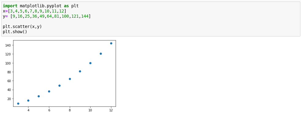
All you need to do is to use the scatter() method in the previous code.
import matplotlib.pyplot as plt
x=[3,4,5,6,7,8,9,10,11,12]
y= [9,16,25,36,49,64,81,100,121,144]
plt.scatter(x,y)
plt.show()
Pie Chart
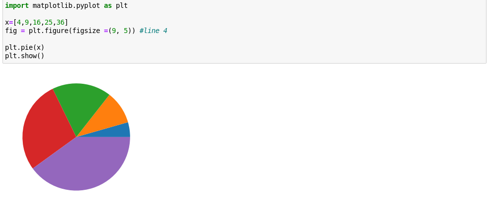
A pie plot is a bit different from the rest above. Line 4 is of particular interest, so take a look at the features there.
figsize is used to set the aspect ratio. You can set this to anything you like (e.g (9,5)), but the official Pandas docs advise that you use an aspect ratio of 1.
import matplotlib.pyplot as plt
x=[4,9,16,25,36]
fig = plt.figure(figsize =(9, 5)) # line 4
plt.pie(x)
plt.show()
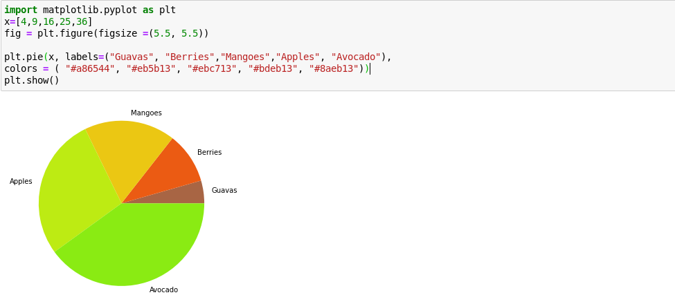
There are some parameters the pie chart has that are noteworthy:
labels – This can be used to give a label to each slice in the pie chart.
colors – This can be used to give predefined colors to each of the slices. You can specify colors both in text form (e.g “yellow”) or in hex form(e.g “#ebc713”).
See the example below:
import matplotlib.pyplot as plt
x=[4,9,16,25,36]
fig = plt.figure(figsize =(5.5, 5.5))
plt.pie(x, labels=("Guavas", "Berries","Mangoes","Apples", "Avocado"),
colors = ( "#a86544", "#eb5b13", "#ebc713", "#bdeb13", "#8aeb13"))
plt.show()
There are also other plots like hist, area and kde that you can read more about on Pandas docs.
Plot Formatting
In the plots above, there aren’t any aspects such as labels. Here’s how to do that.
To add a title, include the code below in your Jupyter Notebook:
matplotlib.pyplot.title("My Graph Title")The x and y axes can be respectively labelled as below:
matplotlib.pyplot.xlabel("my x-axis label")
matplotlib.pyplot.ylabel("my y-axis label")
Learning More
You can run the help() command in your notebook to get interactive assistance about Jupyter commands. To get more information on an a particular object, you can use help(object).
You’ll also find it a good practice to try drawing graphs using datasets from csv files. Learning how to visualize data is a powerful tool to communicate and analyze your findings, so it’s worth taking some time to build your skill.

