Are you developing or designing an app? Then one thing you need to give serious consideration to is the color scheme. Read on to find the best tips that will help you to choose the correct set of colors from a massive color combination chart.
Color is an essential component of visual communication. So if you’re creating an app for a brand, you will need to choose the appropriate color scheme for success. Here is our guide to choosing the right color scheme for your (or your client’s) app.
1. The Analogous and Monochromatic Methods of Color Selection
App designers employ different processes to pick the color palette for their apps. The most used methods are the analogous method and the monochromatic method of color choice.

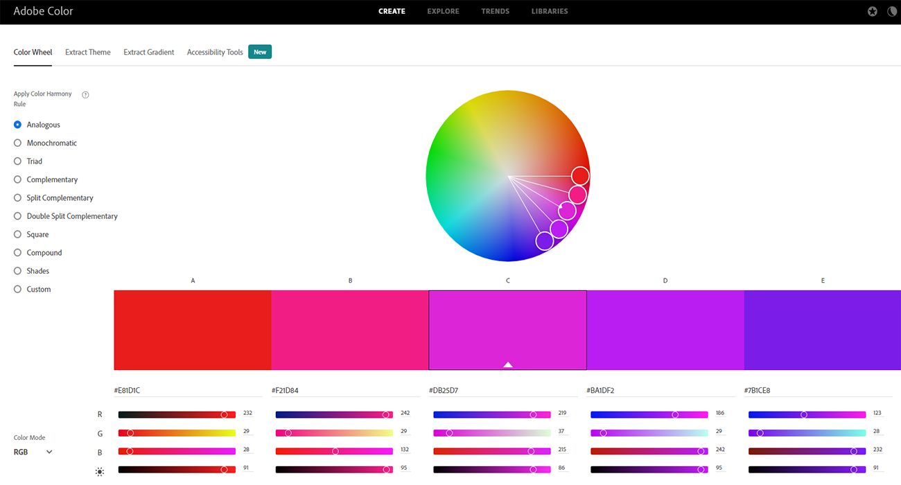
In the analogous method, you need to select one base color from the color wheel. Then you’ll need to choose a few more colors that are adjacent to the base color on the color circle. It is the dominating color, and the rest will complement the base color. The resulting color diversity is highly acceptable to the eyes, and will ensure all app segments look harmonious.

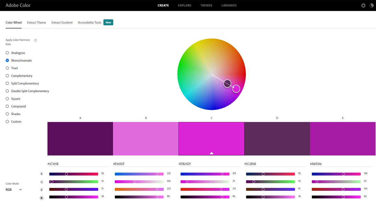
If you consider the monochromatic method, you’ll have to choose one base color or hue for the app. Then you’ll need to use its tints, tones, and shades to generate variations. This method works well for the yellow color palette, bright color palette, blue color palette, and green color palette.
2. Perform In-Depth Competitor Analysis

You need to research the market for apps that are potential competitors to yours. Then find out the rating of those apps from prominent platforms like the Google Play Store and the Apple App Store. Now, narrow down the vast list of apps to a few depending on their ratings.
You can look into these top-ranking apps and get inspirational ideas. This approach works well when you have to take your product online as soon as possible.
3. Consider the Content Legibility

You’ll need to ensure that app elements like buttons, texts, borders, background, foregrounds, etc. are clearly visible within the app. Make sure that you don’t put bright-colored app elements against a bright-colored background. Always maintain a contrast between the elements and the background of the app.
When you need to choose the contrast ratio, you should start with a ratio of at least 4.5:1. However, the 7:1 contrast ratio is a standard measurement as it complies with maximum accessibility standards.
Many reputed app developers follow Apple’s lead in shifting to the dark user interface (UI) for apps. If you like dark colors, you can try a nude color palette, gray color palette, teal color palette, or fall color palette.
4. Focus on Highlighting Your or Your Client’s Brand Color(s)

Your or the client’s brand needs to make a strong presence in the app through its unique color. Colors stimulate customer’s attraction to a specific brand and increase user loyalty as well.
Famous brands like Netflix, Marvel, Coca-Cola, Toyota, CNN, Kellogg’s, Target, and Tesla predominately use red in their apps. The red color symbolizes vigor, excitement, passion, energy, and love in the products of these brands.
You also need to choose a color for your brand as per the product or service you offer. Then strategically place that color within the app without compromising the user experience.
5. Establish UI Hierarchy Through the Color Scheme

You should select the color scheme depending on the UI elements of the app. Color helps the designer to establish an unmistakable visual hierarchy of UI elements within the app.
You should choose the right hue, tint, or shades of color when designing interactive and non-interactive UI elements. You’ll also need to distinguish the crucial app options from less important ones through contrasting colors.
6. Use Colors for Effortless and Productive Brand Communication

For effective communication with the customer, you’ll need the right color palette and informative content. Therefore, you can see that color is an important vehicle to deliver brand communication.
You can motivate the customer to press the call to action (CTA) buttons, subscribe to newsletter forms, and buy products by choosing the right colors for these app elements.
For notifications, activations, deactivations, and error messages, choose the color that is not present on that section of the app.
7. Consider the Target Audience

You should find out the target audience’s expectations before you select a color scheme for your app. You should carry out in-depth research of the market to know the average user age, gender ratio, cultural diversity, etc.
Once you have figured out the demographics of the customers of your product, it’ll be easier for you to choose a harmonious color scheme for them. A real-life example is the Calm app, an app for meditation and sleep, which uses a blue color palette for the mobile app. It’s because women and men both like the color blue equally.
Another crucial consideration is that the color scheme should increase app accessibility features for color-blind users. You need to perform rigorous testing of your app to ensure that color-blind users won’t face any challenges in interacting with it.
8. Begin With a Color That You or Your Client Likes

An effortless way to choose the right color scheme is to start with one color and then improvise during the testing sessions. If you end up selecting a set of colors at the beginning of the app design process, you may experience challenges in finding harmony between multiple colors.
9. Take Smart Risks by Being Innovative
You can also experiment with the color scheme selection part if you have some time in hand. Some designers also go above and beyond trending methods and develop something out of the box that sees success.
For example, Google revamped all of its mobile apps with new color schemes that are somewhat off the trending chart. Despite criticism, the company is sticking to its new designs. The brand is likely aiming to increase visibility among the users through unusual sets of colors and consistency across its offerings.
10. Keep Saving Your Color Scheme Experiments
Save your experimental ideas if you find a color or a color scheme. You may not implement the idea right now, but you’ll have some options for future app designing projects. You don’t need to use the same color scheme in every project, but you can show your ideas to the clients to see if they approve or not.
Apply the Right Color Scheme for Your Users
By following the above tips, you’ll be able to choose the best color scheme that’ll increase your app’s functionality and individuality. Which is the best way to grab user attention to your app in an increasingly competitive market.


